What is Campaign photography?
Campaign photography tries to persuade the audience to stand up and fight for their beliefs - such as anti-bullying, anti- racism etc.
It also can be used as help posters to make people realise it is not acceptable and they must get help if they are a victim.
'Don't write us off' campaign
A picture speaks a thousand words. For the young people volunteering for the ‘Don’t Write Us Off’ campaign this saying really rang true. Many of the young people didn’t feel that people listened to them, and found it difficult to describe how they felt through words.
So the idea of this project was to train and support a group of care leavers to produce a series of photographs which would tell the realities of being in care, the good and the bad.

The photograph is in black and white making the image look depressing. The background shows the photographer has tried to create a scene that looks like a home because you can see the shelf and sofa. The girl looks like she is aged 13 to 14 years old and she looks very sad. The girl is depressed and she wants to make someone promise her that there not going to hurt themselves. I think this is a very powerful image.

This photograph is black and white as this helps to create a depressing look. The photographer is displaying items in which someone can use to kill themselves. It looks like the photograph could have been taken in the home because the background is the white similar to a dining table also the knife looks like a kitchen knife. The light is focused on the tip of the knife which is sharp, the photo is cropped to produce a strong composition.
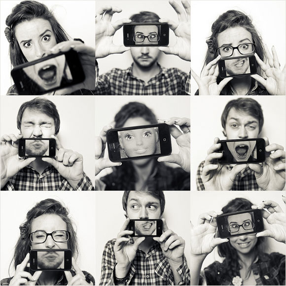
In this photograph everyone is taking selfies. In the photo they have set the focus point on different places meaning that this image is produced combining many separately taken photographs as this effect would not be possible with one image. I think that the photographs have been taken with the same f-stop f.15 to f.16 to produce a medium depth of field. The photographs have been taken in the studio to control the lighting and the environment.


In the poster they have thought carefully about the position of the text, the designer has chosen a part of the picture that isn’t important to make the text stand out but not distract from the image.
PLAN
For my campaign I am going to focus on bullying. In my shoot I want to show someone with a broken spirit who is being bullied.
1. I need a camera.
2. some face paints to make some bruises.
3. I will use small and medium F-stop 4.5 and 15 to see which depth of field works best.
4. I will use my phone light to create shadows.
5. The photo will be taken inside in a class room or toilet to create an environment where bullies are found.
1st SHOOT


worst shoot

This is my first shoot I feel that this is the worst photograph from this shoot because it is out of focus. I did not use the correct depth of field it is not clear as to what the person is doing because the angle is not correct .
Best shoot

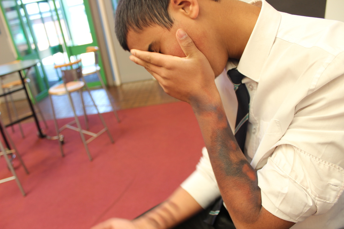
I was trying to show someone who is being bullied by another pupil in the toilets. The person is trying to put his face inside of the toilet and punching him.
In this photograph I used the toilet as a background the colour is limited,white and a bit of red this was to make the shoot stand out. The focus is not very clear in this shoot because of the movement, I will improve this in my next shoot.
In this photograph I used the toilet as a background the colour is limited,white and a bit of red this was to make the shoot stand out. The focus is not very clear in this shoot because of the movement, I will improve this in my next shoot.
2nd shoot


In this shoot I made a bruises using face paint. I used the school background to look like it was based in a school. In this shoot I tried to make the bruises look like someone had been grabbed by the hand. The lighting is a little orange and would benefit from setting the camera at tungsten to add a blue filter to it.
worst shoot

This is my worst shoot because the camera is out of focus and I didn't use the correct depth of field the angle is not right because in this angle you can see the table and the F-stop is too close is 4.5. And the shutter speed was slow because it was a dark environment so my hand was shaking I need to use the tripod.
BEST SHOOT
This is my best shoot because in this shoot I have used a medium depth of field. I have tried to show the school background to create a environment where bullies might have been, if I did this shoot again I would maybe have knocked one of the chairs over to show what had happened previously.
plan for 3RD shoot!!
This time I am going to try to display in my shoot that someone is lost after being a victim of bullying. They are looking for people to ask for help but there is no one around . I will use the school fence and the road for this as it will create depth to my photograph with the lines of the fence and the lines of the road, I will use a medium depth of field and the focus will be on the persons face.
3rd shoot


worst shoot

This is my worst photograph because it is out of focus, I have not used the correct angle as you can not see his face clearly my focus point was not in the correct place. If I was to take the photograph again I would but the focus point on his face to be able to capture the emotions and expressions on his face.
BEST SHOTS
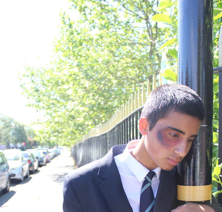
I really like this picture as the composition shows loneliness and real emotion , the space shows how alone you can feel when you are being bullied.
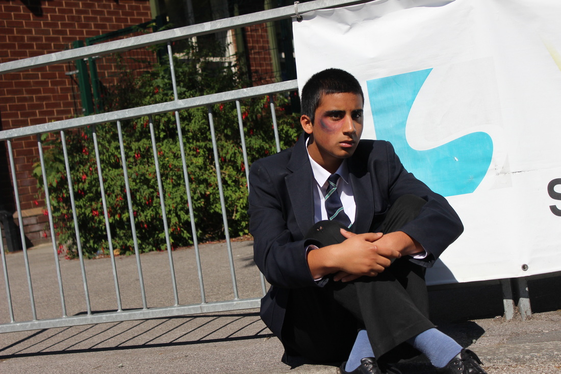
This is my best photograph because the angle I have used has captured his face expressions you can see the he is in deep thought.
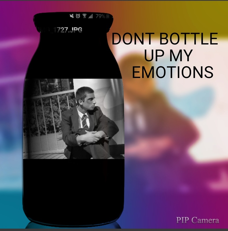
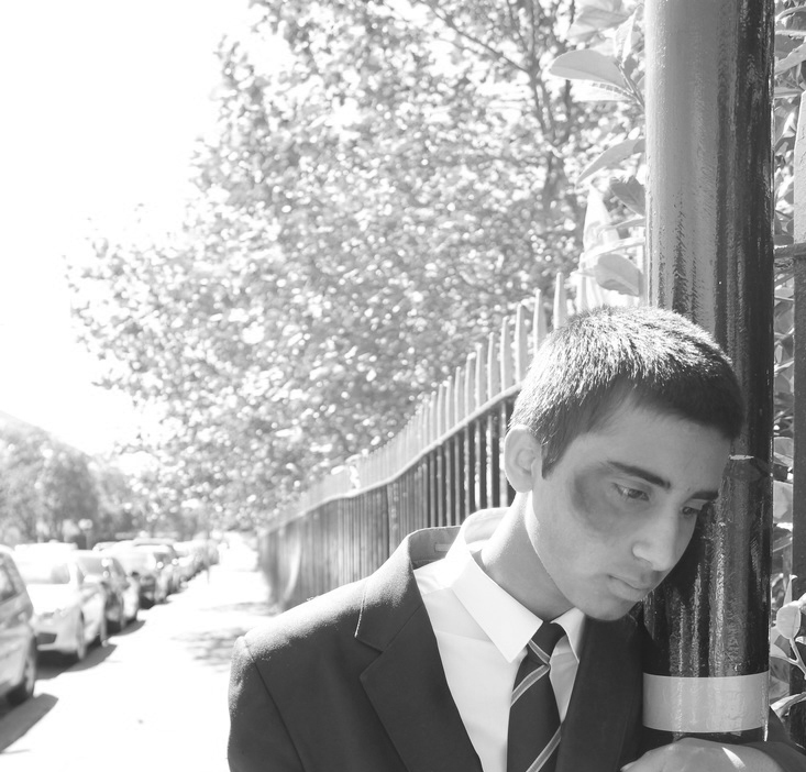
I have edited this photograph by using phone editor PIP camera. In background I have used Fantasy effect I have made the bottle black and white.
Plan for 4th shoot
This time I am going to do anti drugs.
In this shoot I will use a person who is addicted to drugs.
I will use different depths of fields.
I will use phone light.
I am going to use the white balance.
I will use the Photoshop to edit my photographs.
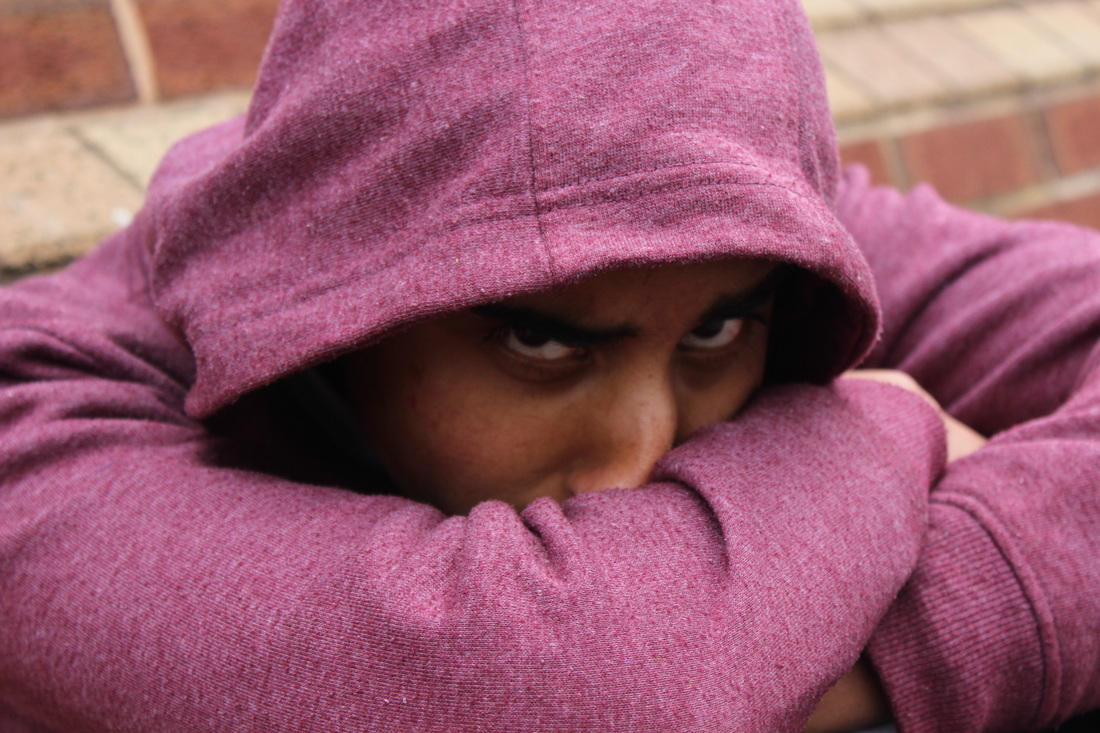
4th shoot


worst shoot

This is my worst photograph because the background is too bright and slightly over exposed.
BEST SHOOT
I like this photograph because you can see his facial expression. I have cropped the image to draw your attention to his eyes
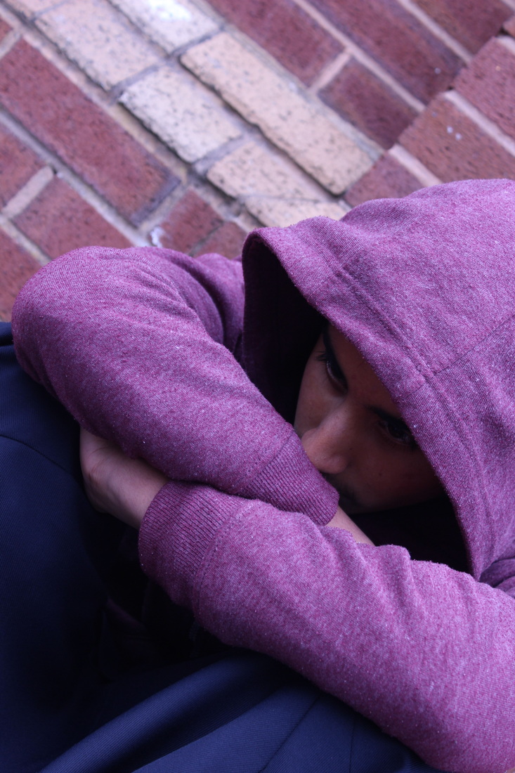
In this photograph I have applied standard fluorescent white balance to add a blue depressing feel to the image


On Photoshop I used the magnetic tool to crop the background, then I used the gradient tool to paint the background I used the horizontal type tool to write the words. I then tried different texts to see which one looked best.

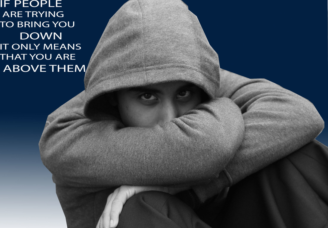
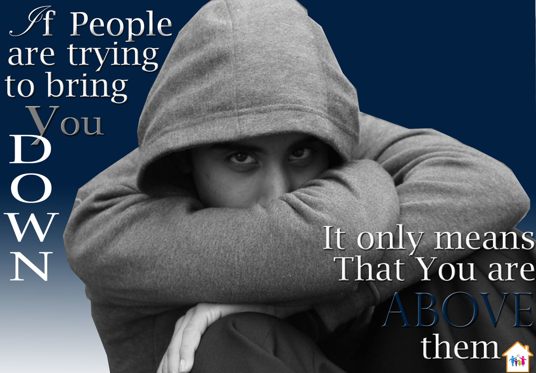
I'm really pleased with this final picture I like the layout of the text and think it makes you stop and think.
